
ASPIRE Adapt Coaching
Brand Identity & Collateral DesignFreelance Project
Contact Me
Fill out a form
The Brief
AspireAdapt Coaching needed a brand that was as impactful as its mission: helping women turn challenges into triumphs so they can adapt and thrive. They focus on personalised life coaching and growth.
The Challenge: The identity had to be bold, inspiring, and feel highly personal - moving far beyond a soft, gentle "wellness" aesthetic. It needed to capture the energy of their motto: "ADAPT · EVOLVE · THRIVE."
The Solution
I created a confident, dynamic brand system that feels less like consulting and more like a powerful personal ally.
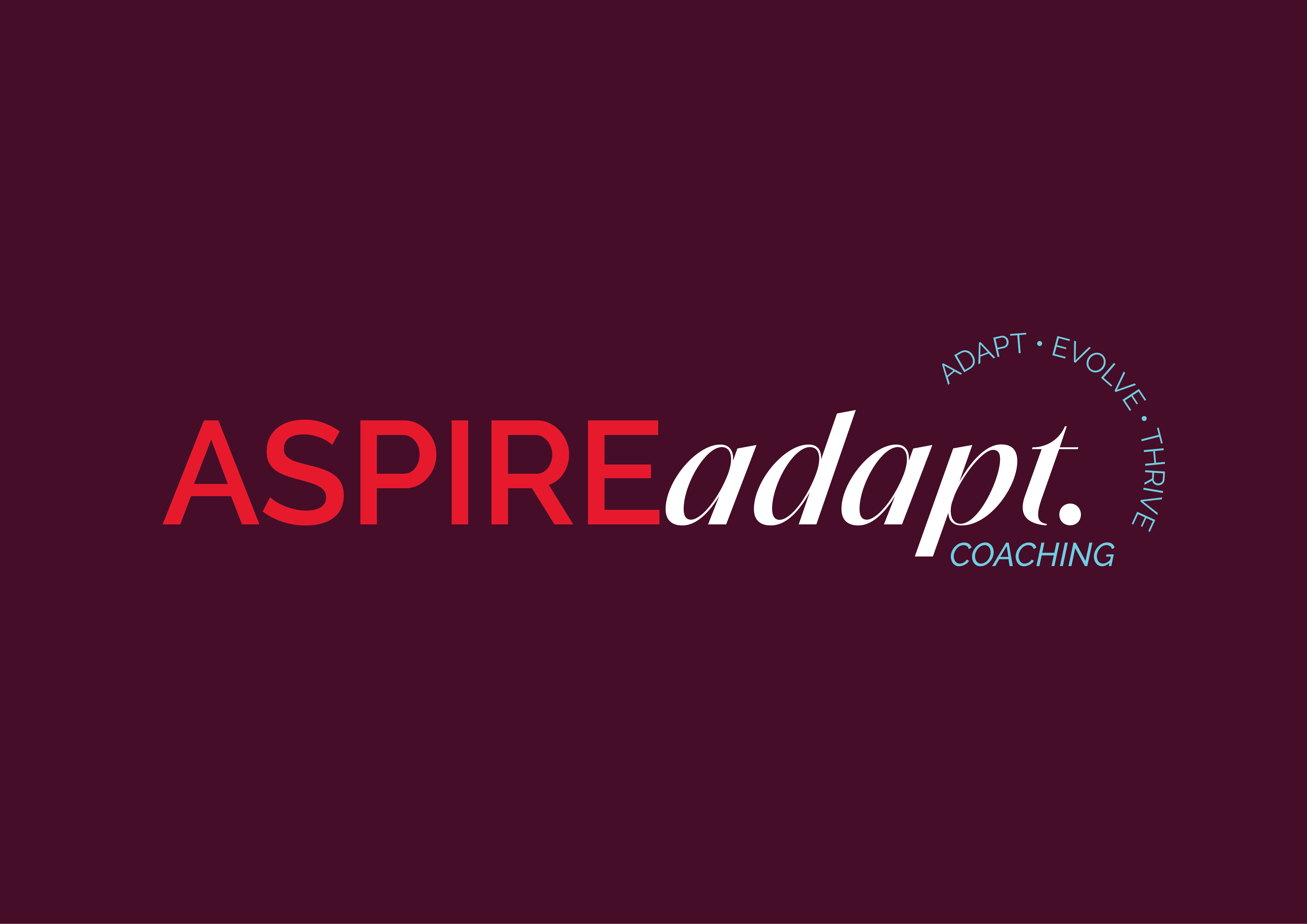
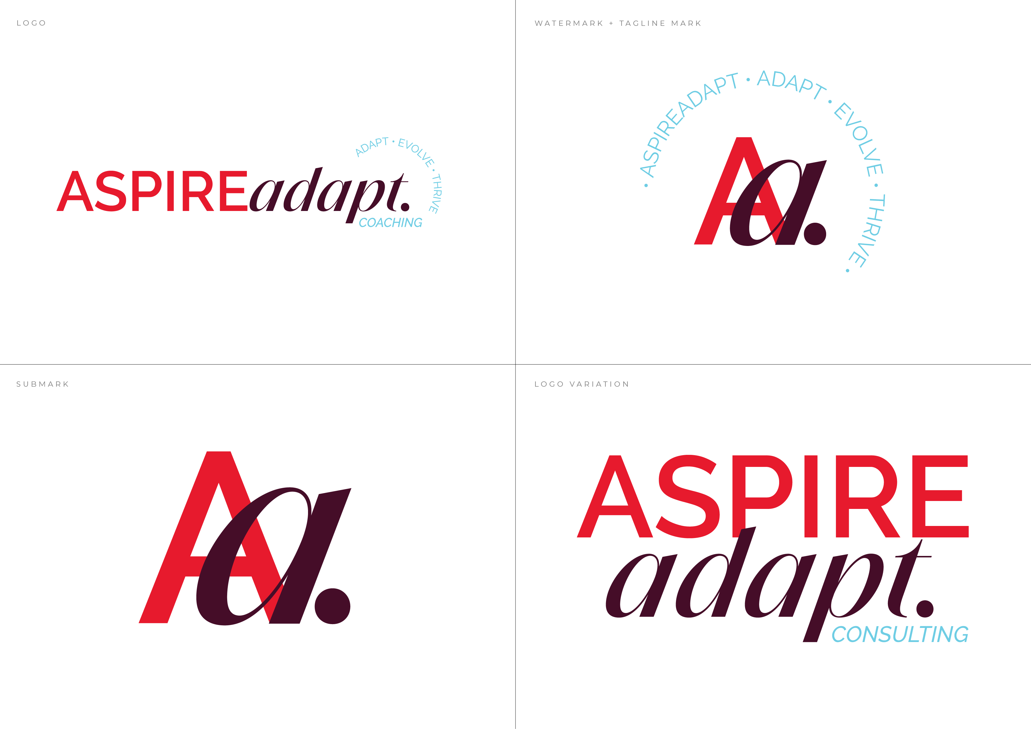
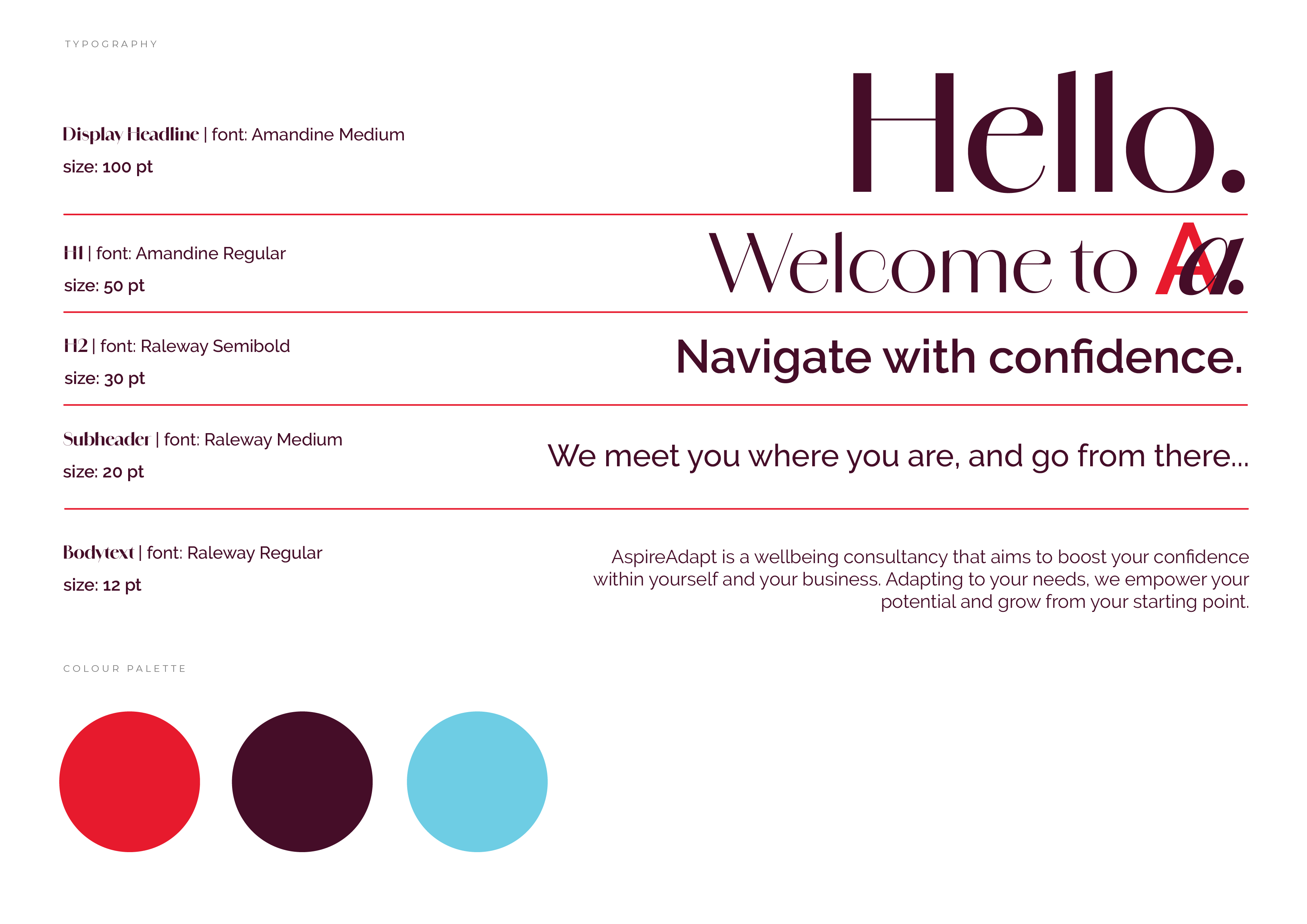
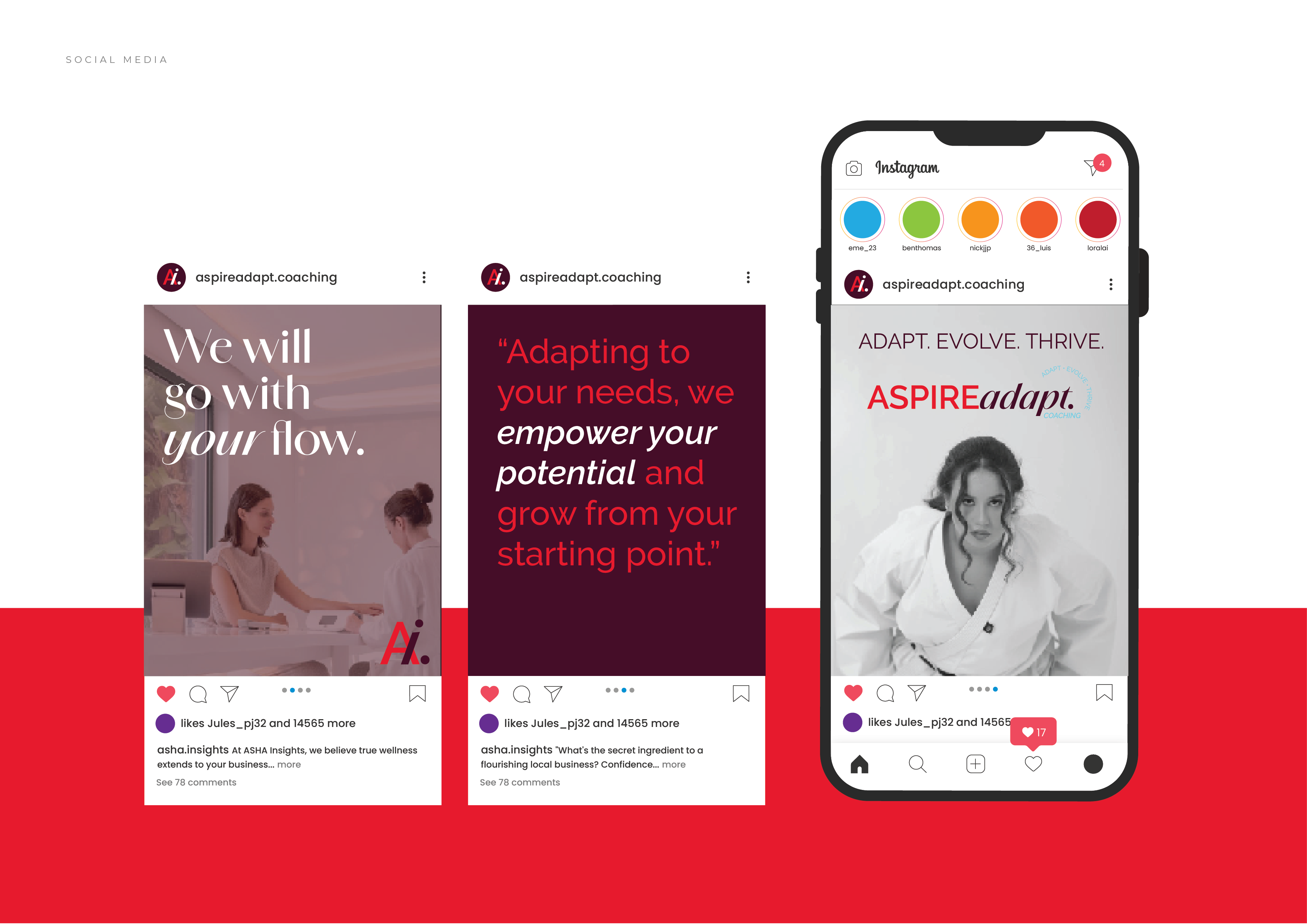
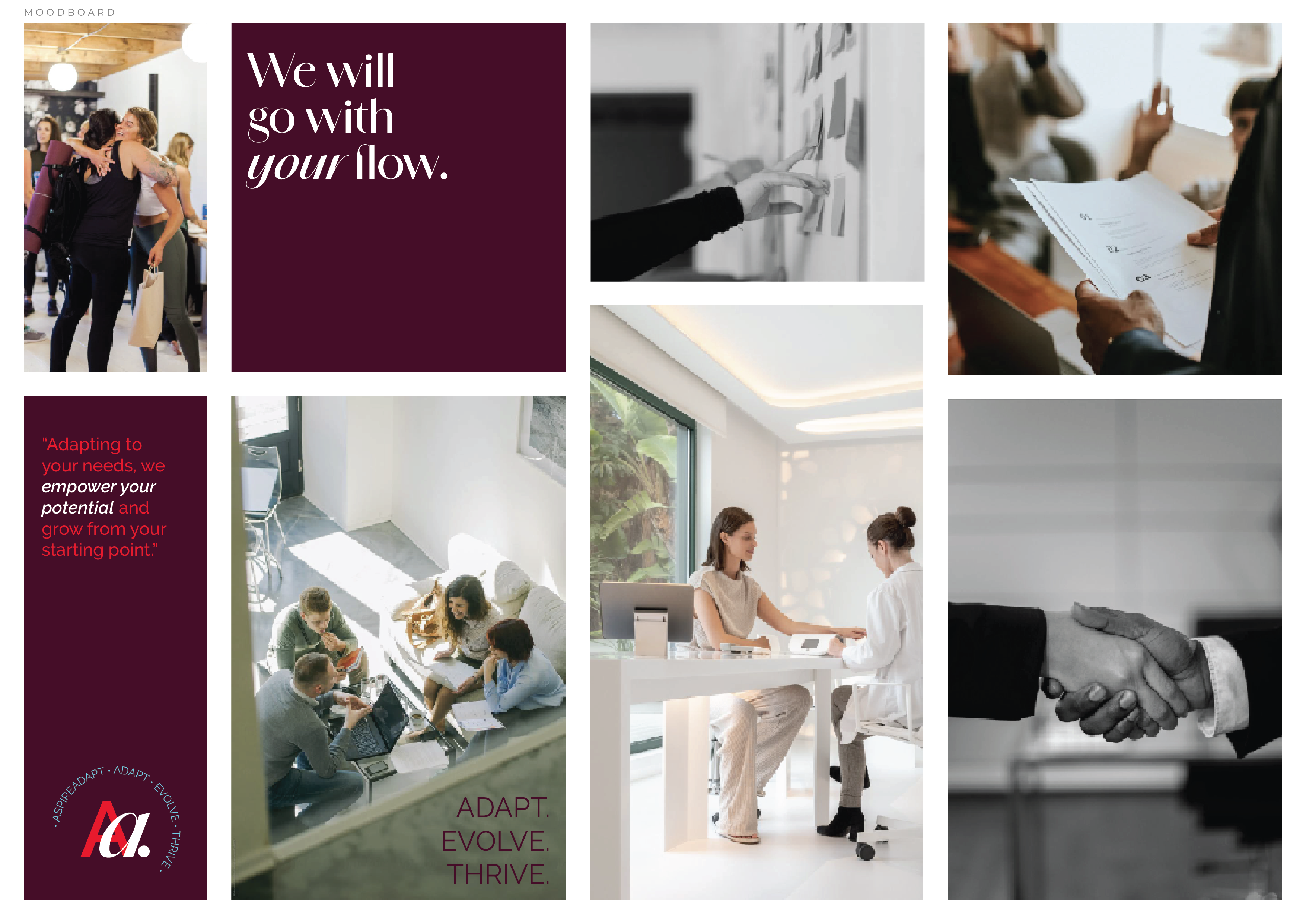
- The Look and FeelThe identity is built on a high-contrast palette: Vibrant Red (energy, action) and deep Maroon (sophistication, depth), accented by a hopeful Sky Blue. The custom logo combines a strong, capitalised sans-serif (ASPIRE) with a flowing, italic serif (adapt), symbolising the balance between bold ambition and personal flexibility.
- Key Results
- The Power Mark: The custom 'A.a.' monogram is sharp and memorable, working perfectly as a subtle, powerful watermark on everything from business cards to social media.
- A Relatable Voice: The messaging focuses entirely on the client: "We will go with your flow" and "Adapting to your needs, we empower your potential." This immediately establishes trust and empathy.
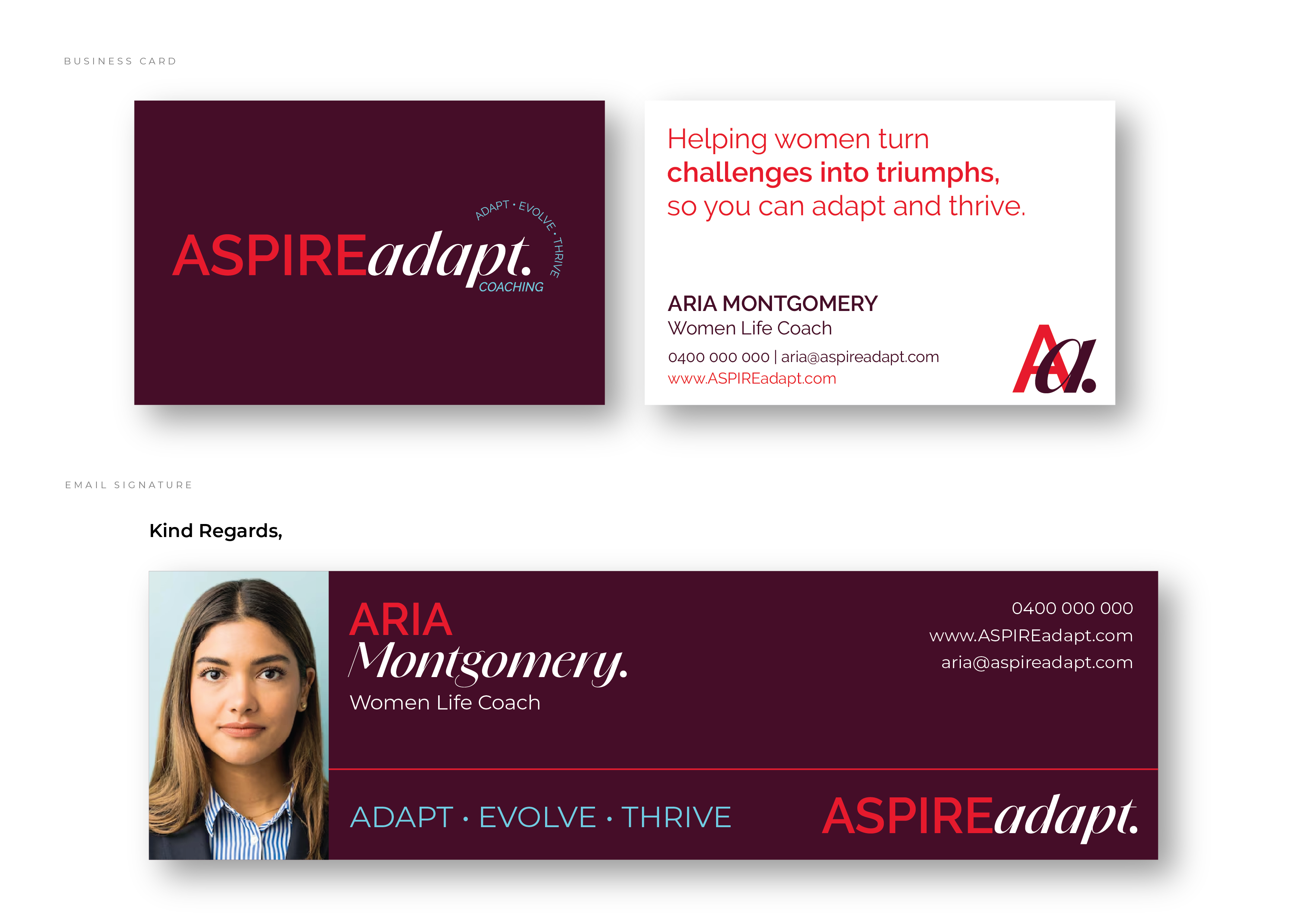
- A Confident System: The brand easily translates across all touch points, using dynamic imagery and clear typography to maintain a premium yet accessible feel, from the professional business card to the inspirational social content.
The new AspireAdapt identity successfully captures the energy needed to motivate real change and establishes the coach as a decisive partner in personal evolution.

ASPIRE Adapt Coaching
Brand Identity & Collateral DesignFreelance Project
Contact Me
Fill out a form
The Brief
AspireAdapt Coaching needed a brand that was as impactful as its mission: helping women turn challenges into triumphs so they can adapt and thrive. They focus on personalised life coaching and growth.
The Challenge: The identity had to be bold, inspiring, and feel highly personal - moving far beyond a soft, gentle "wellness" aesthetic. It needed to capture the energy of their motto: "ADAPT · EVOLVE · THRIVE."
The Solution
I created a confident, dynamic brand system that feels less like consulting and more like a powerful personal ally.
- The Look and FeelThe identity is built on a high-contrast palette: Vibrant Red (energy, action) and deep Maroon (sophistication, depth), accented by a hopeful Sky Blue. The custom logo combines a strong, capitalised sans-serif (ASPIRE) with a flowing, italic serif (adapt), symbolising the balance between bold ambition and personal flexibility.
- Key Results
- The Power Mark: The custom 'A.a.' monogram is sharp and memorable, working perfectly as a subtle, powerful watermark on everything from business cards to social media.
- A Relatable Voice: The messaging focuses entirely on the client: "We will go with your flow" and "Adapting to your needs, we empower your potential." This immediately establishes trust and empathy.
- A Confident System: The brand easily translates across all touch points, using dynamic imagery and clear typography to maintain a premium yet accessible feel, from the professional business card to the inspirational social content.
The new AspireAdapt identity successfully captures the energy needed to motivate real change and establishes the coach as a decisive partner in personal evolution.